Course Resource
Lesson 2: The Visual Toolbox
Part A. Learning to See: The Order Behind Images
Most drawing teachers will attempt to teach you to draw what you see. This may sound obvious, but it's an important bit of information. When we learn to draw from observation, we often become distracted by what we know about an object. For example, we know that object X should have these proportions, or that object Y should have this particular shape. We often pay more attention to this knowledge than to what we see. When that happens, we end up drawing the object that is in our minds rather than the edges, shapes, and forms that are in front of us. When drawing from observation, then, it's important to ignore the mental images that we carry around with us. Believe it or not, squinting is a good technique to help us focus on the general shapes of the object, rather than on the object itself. Try it. Find an interesting arrangement of items near you (a fruit basket, a pile of books), then squint and look at it again. Does it become a slightly more simplified collection of shapes?
The artist René Magritte (1898–1967) painted the image you see below, The Treachery of Images, in 1929. The image says, in French, "This is not a pipe." (Because this image is so iconic, you'll see it lots of places, such as on cookie boxes from Belgium, Magritte's country of birth.) Although the statement about the pipe is obvious and, perhaps, a little funny, Magritte was saying something important about images. What you are looking at is, in fact, not a pipe. It is an image of a pipe. It is important to note that there is a distinction between the two because we as human beings often fail to recognize that distinction.
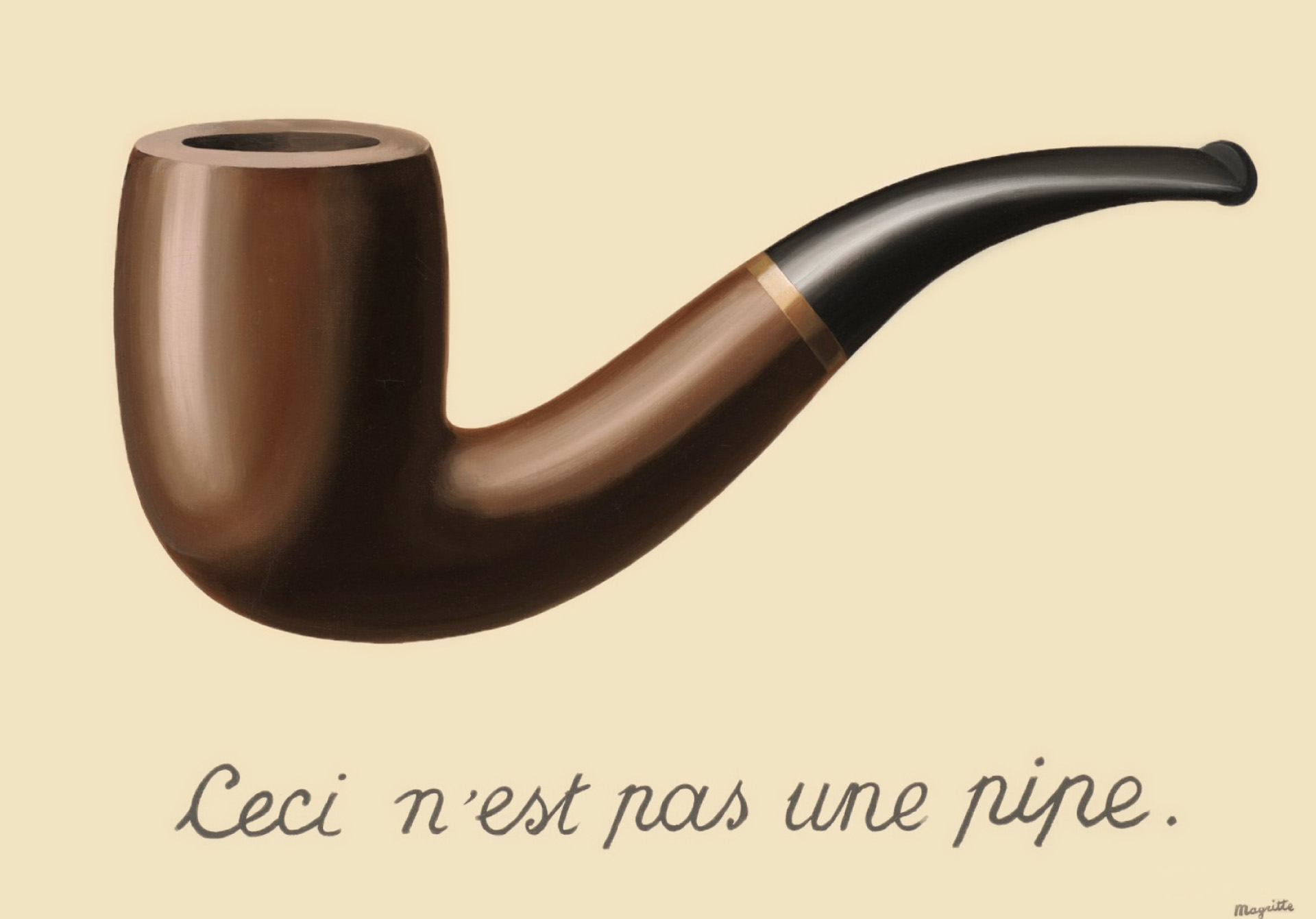
Retrieved from Wikipedia
The following video, which was plucked from our Design I: Arrangement and Color course, explains the idea of disassociation, which means learning to see the shapes that make up an image rather than seeing our relationship to, or prior knowledge about, the objects. This is an important skill to develop for an artist because the images that we store in our brain often aren't the most reliable sources of visual information. What does this mean to you as a reader of images? Simply that you can break down and understand a composition objectively in terms of principles such as shape, line, and hierarchy. You can understand what an artist did to achieve a certain reading of the image presented.
Richard Vosseller, Program Director, Graphic Communication and Arts
In this lesson, we will talk about some of the principles of composition as shown in the video. When cultivating visual literacy, it's important for us to learn the terminology used to describe the strategies employed by visual designers when creating anything from fliers to website designs to stock photography. We will talk about things like points, lines, and shapes and what those terms really mean. And we will talk about things like balance and symmetry and how these strategies can be used to communicate complex ideas.
One of the outcomes of disassociation is to realize that you, as the viewer, are part of the way in which an image operates. An image requires that you, the viewer, be looking at it! In this respect, it's important to ask, where am I in this image? The answer would be perspective. Foreshortening and perspective are a way in which the artist or designer can place the viewer in relation to the image. Are you looking down at the image? Are you looking up at the image? Where are you in the picture?
Foreshortening
Foreshortening means that objects that are far away are drawn smaller and objects that are near are drawn larger. It also means when you draw something from a particular angle, you will likely have to distort some of the shapes that you thought were characteristic of the object you are drawing. Your final depiction of the object, say a glass, may be hardly recognizable as such, depending on the angle you are drawing it from. Like we mentioned before, you need to put aside what you know in favor of what you see.
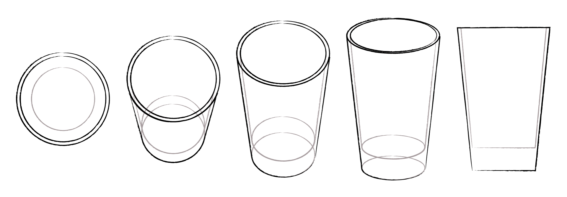
based on "Keys to Drawing" by Bert Dodson
Perspective
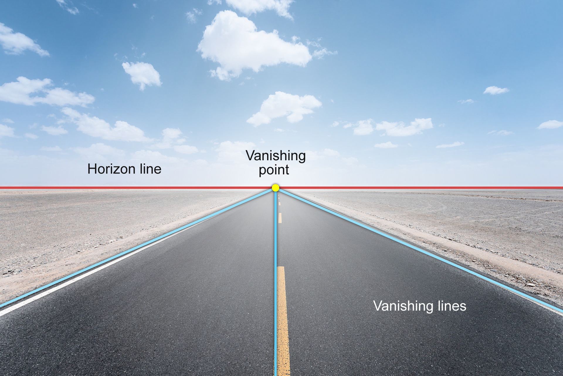
Foreshortening is based on linear perspective, which was created by artists/scientists in the early Renaissance (Gombrich, 1995). Linear perspective addresses how objects change in appearance when seen from different positions relative to the observer—off to one side, directly in front, close or far away, above or below. It establishes that all of the objects in our field of view vanish (meaning that they get smaller and smaller) toward the horizon line and their vanishing lines meet at a common point on the horizon called the vanishing point.
The image of an open road can help us understand linear perspective. If we look at this image, we see a very clear horizon line, vanishing point, and vanishing lines.

Xuanyu Han / Moment Collection / Getty
The points and lines are labeled below:
Xuanyu Han / Moment Collection / Getty
The horizon line is always at your eye level. Imagine you are at the beach on a clear day, looking out to sea. You can see where the water meets the sky; this is your horizon line. If you were to sit down in a beach chair, the horizon line would follow you down to your new eye level.
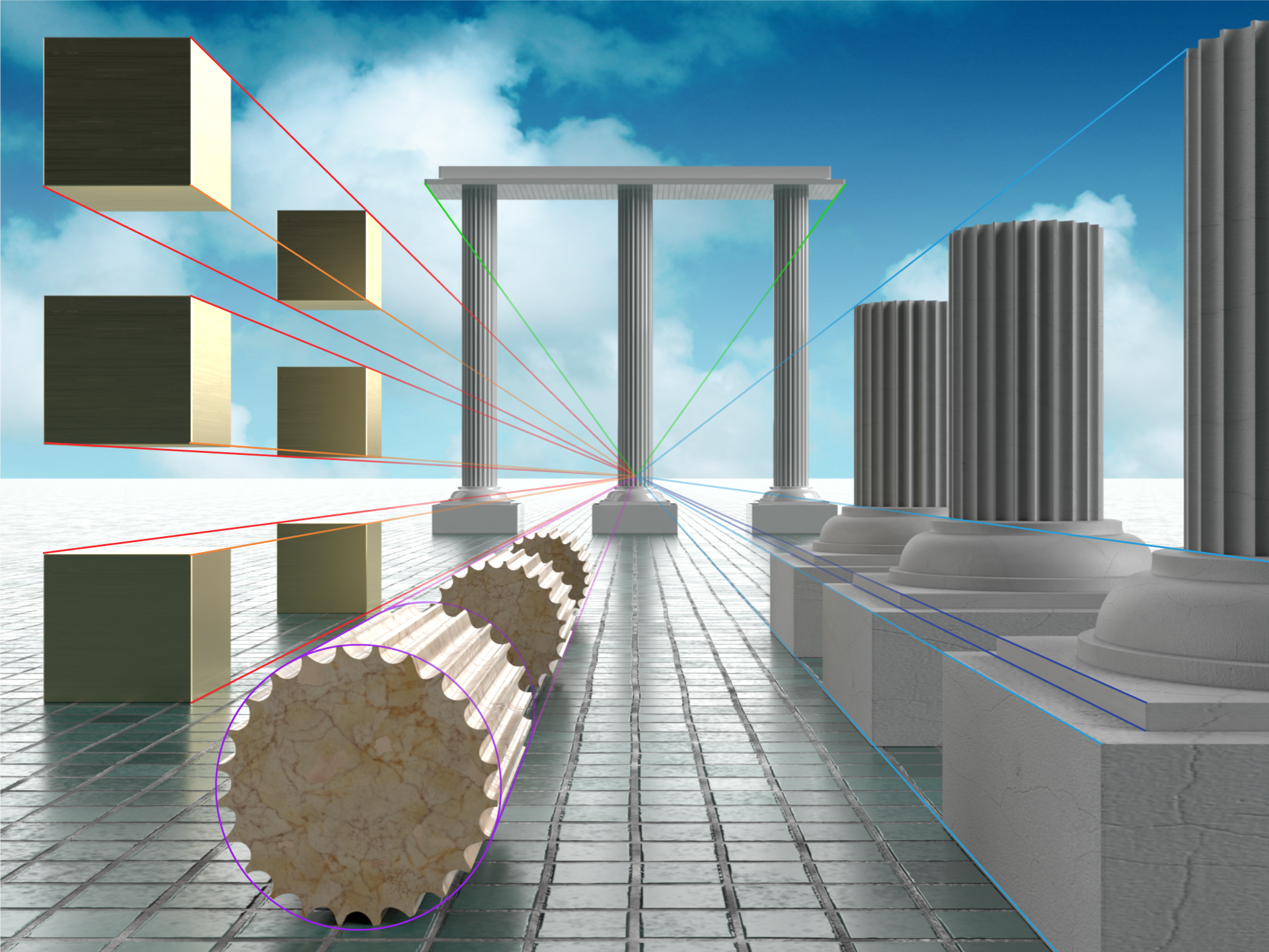
Here is a more complicated image with the vanishing lines shown disappearing at the vanishing point on the horizon line.
Now that you've learned about foreshortening and perspective, how do these principles affect your reading of an image?
The effect of perspective on an image isn't limited to geometry. Photographers in particular play with perspective, and with their placement of the horizon line in the composition, to elicit a response from their viewers. The image on the left shows a portrait of a young man taken from a low vantage point looking up. This angle of view imbues the subject with strength and gives a sense of empowerment and control. A portrait taken from above, as shown on the right, can have quite the opposite effect, making the subject seem small, childlike, and playful.

Jon Feingersh Photography Inc. / DigitalVision / Getty

Tom Merton / OJO Images / Getty
Ask Yourself
As you go about your daily life, reflect on the photos and illustrations you see. How does the artist use perspective to guide you to think about the subject?
The next time you take a photograph, reflect on how you are conveying perspective. Are you taking that selfie from above or below? Is that close-up of your cat's face at eye-level? Is the subject of the image far away or squished against the lens? Think about what you're saying with the photo and how your camera placement amplifies your message.
Part B. Learning to Read: Principles of Design
Seeing images requires learning to distance yourself from what you know and just focus on what you see. Artists, designers, and visual communicators know this and can use it to their advantage to have a viewer read an image in a certain way. The individual methods by which they organize an image are called principles of design or visual principles.
If you know these principles, you can more comfortably notice, describe, and discuss varying visual strategies—and more consciously use them.
Take the image below as an example. The photographer deliberately uses the principles of symmetry, balance, and movement to create an image in which every visual element in the composition appears to be interconnected. This creates a sense of cohesion and unity, which tends to elicit a positive response. Balance is considered to be a fundamental element of visual communication. It can be used to create a sense of order or calm in an image.

fStop Images - Stephan Zirwes / Brand X Pictures / Getty
On the other hand, compositions that are visually unbalanced, like the image below, create a sense of tension. There is nothing wrong with this composition. In fact, creating a visually unbalanced composition that is appealing and interesting to look at is probably more difficult than achieving a balanced one. But an unbalanced composition creates a sense of unease, of drama even, as if something that hasn't yet happened is about to happen. And this is something that a visual communicator needs to understand well.

tacojim / E+ Collection / Getty
Below, we will discuss the following visual design principles and how they are used to elicit a response from the viewer.
Note that our list is not comprehensive; it contains a sampling of principles to get you started.
Resources
Now, click the tabs to see examples of each principle. (Note that we don't single out tension for discussion, though we do allude to it.)
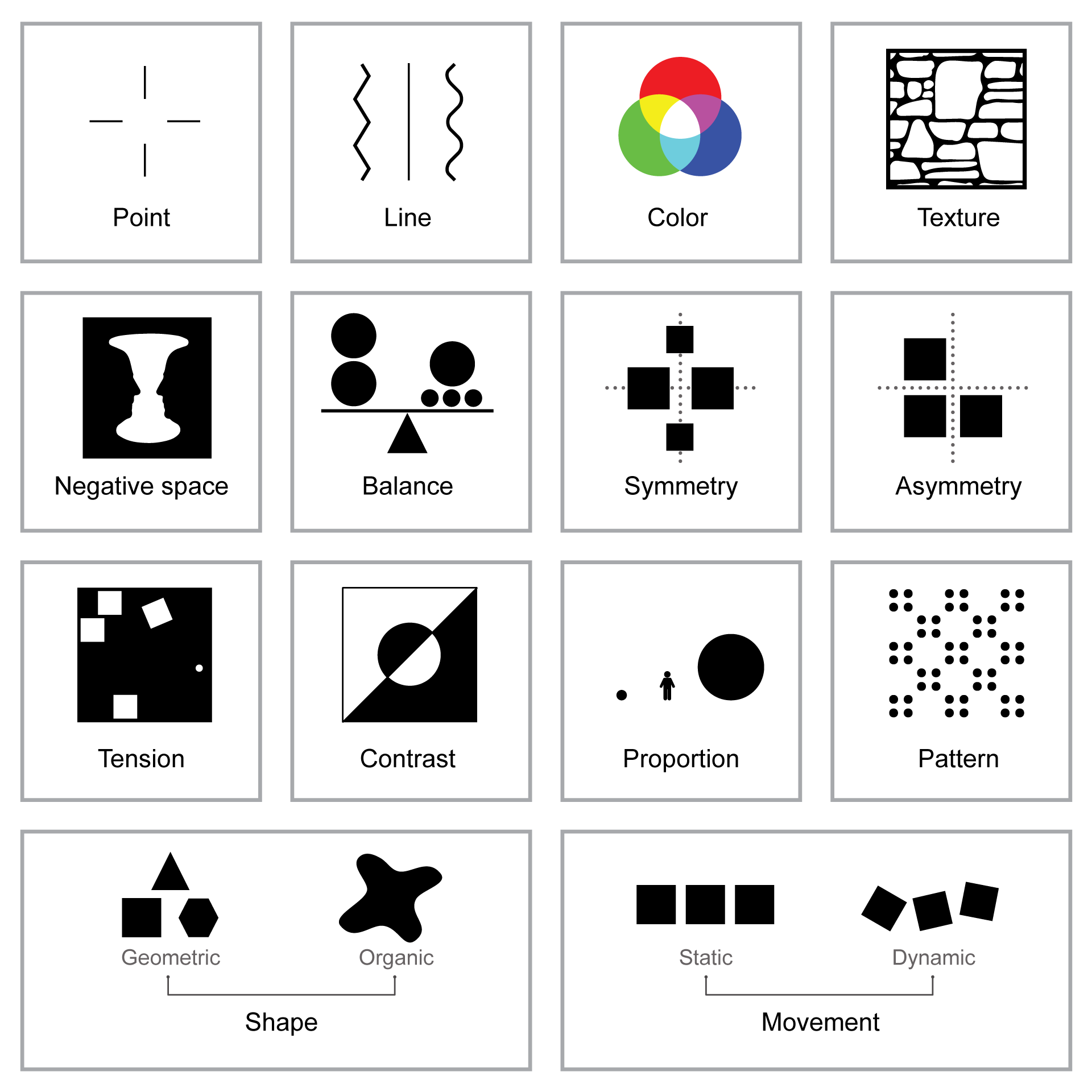
Visual Principles
- Point
- Line
- Shape
- Color
- Texture
- Movement
- Negative Space
- Balance
- Symmetry
- Asymmetry
- Contrast
- Proportion
- Pattern
Point is the simplest geometric element and basic building block of every line, texture, and shape. A point is a coordinate or location on a surface.
Points do not have to be literal. They can be implied and used visually to drive viewers' attention. In the image below, the red teacup is a focal point for the viewer's gaze because it is separated from the rest of the visual field by way of its color. You could achieve the same effect in a photo of partygoers in which one is wearing a hat or leaning forward to blow out a candle on a birthday cake.

Daniel Grizelj / DigitalVision / Getty
Line is the second-most basic element of design. A line is a collection of points located next to one another and arranged linearly. Without lines, we would be unable to represent the simplest of shapes like circles, squares, or triangles. A line connects or separates other elements in a composition.
Implied lines are powerful compositional elements. They can connect visual elements to communicate ideas. In the image below, we have an implied line created by the four human figures repeating diagonally across the image. It's no mistake that this diagonal line leads us to the presentation materials in the background, thus creating a sense of unity in the composition and giving the viewer an idea of what all these people are doing.

PeopleImages / E+ Collection / Getty
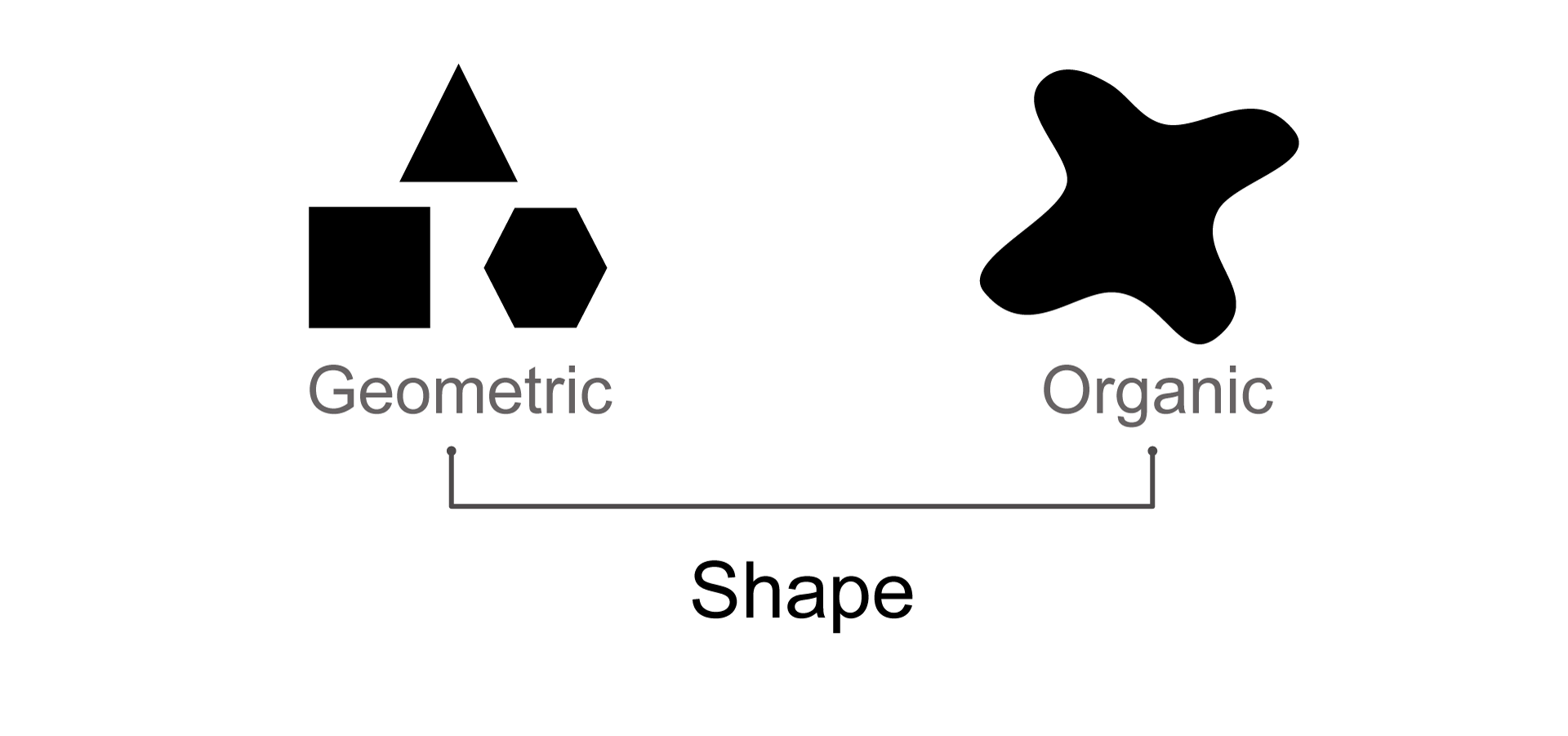
A shape is composed of multiple lines connected together. Shapes are defined by an area that is enclosed by a boundary (line). Shapes can be geometric (square, circle, triangle) or they can be organic (curving lines that might define a human, animal, flower, rock, dirt).
Shapes can be solid or they can be an outline. Curvilinear shapes are more familiar to us and can appear welcoming. Sharp corners and straight lines appear cold and inorganic. The image below shows a solid geometric shape with sharp corners and straight lines—the outlet—and an organic shape with curving lines—the outline of the face.
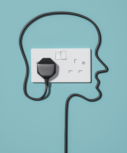
Jonathan Kitchen / DigitalVision Collection / Getty
Color affects us emotionally and enhances the nuances of visual communication. It is used to attract attention, group or separate elements, create hierarchy, reinforce meaning, or decorate a design. Color can't function on its own. It must be integrated into other design elements such as shape or line.
Color is used in the photo below to divide the image into segments, one for the performer and one for the audience. Color also drives the point of focus at the center of the image.
Note also the use of line and shape in the image. Can you see how the visual principles you've learned about so far function to create visual meaning?

Flashpop / DigitalVision / Getty
Texture can be generally defined as the visual property of any surface. In two-dimensional images, we refer to implied texture as there is no real texture there, but texture is indicated. The texture of a surface can be described as hard, soft, rough, smooth, glossy, sandy, bumpy, and so forth.
Texture can't function on its own. It must be integrated into other design elements such as shape or line. Texture, like other visual elements, can be used to create differences between compositional elements.
Note, in the image below, the textural differences among the fruit, the bag, the clothing, the person's arm, and so forth. How would you describe these textures? What do they convey to you? Note that light is an important element in indicating texture. The quality of reflections on a surface tell a viewer a lot about the properties of the texture being represented.

d3sign / Moment Collection / Getty
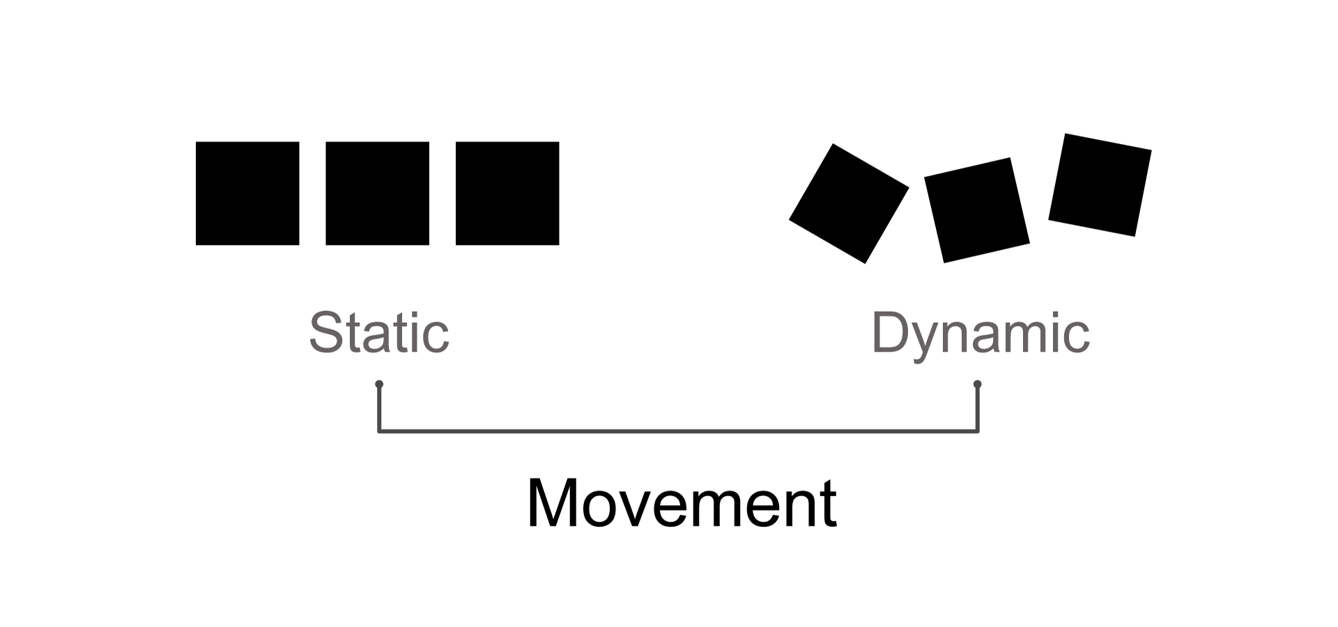
Movement is a design principle that can be represented, suggested, or implied depending on the artist's intention and on the medium.
In sculpture movement, can only ever be implied. In drawing, painting, or design it can be represented or suggested. The representation of movement can be used to move the viewers eye across the image, or it can be used to communicate an idea related to movement, such as progress, vitality, or defeat.
The photo below uses implied movement in its depiction of a staircase. As our eyes move across the surface of the image, we understand that movement is part of the composition.

sebastian-julian / E+ Collection / Getty
Negative space refers to the spaces created around or within other design elements, such as lines, shapes, and so forth. Negative space is usually empty of graphic elements, but is nevertheless active.
Space that contains graphic elements is referred to as positive space.
Think of a picture of a donut. The donut is positive space. The hole in the middle of the donut is negative space.
When negative space is used thoughtfully, it can create a more visually interesting composition. In the example below, negative space is used to create a sense of imbalance and visual tension in the composition. As noted above, the space holding the cluster of people would be considered positive space.

PeopleImages / E+ Collection / Getty
Look at the following images that show two scenarios of negative space. Are they the same image? Do they read the same way? Why or why not?
Look at the following images that show two scenarios of negative space. Are they the same image? Do they read the same way? Why or why not?


Balance refers to the distribution of graphic elements in a composition. When compositional elements have equal weight in the image, they are said to be in balance. Visual balance can be achieved by emphasizing or deemphasizing color, shape, texture, direction, or value.
Although visual imbalance can lend tension to a composition, visual balance can create a sense of harmony where all visual elements appear to be interconnected.
fStop Images - Stephan Zirwes / Brand X Pictures / Getty
Symmetry achieves visual balance in a composition. Symmetry refers to the arrangement of compositional elements around the central axis (horizontal or vertical) of the composition.
Symmetrical elements are more memorable and tend to receive more attention than asymmetrical elements. They are also more simple and more easily understood.
Symmetry helps to provide a sense of clarity and focus to visual imagery.
Lauri Patterson / E+ Collection / Getty
Asymmetry is the opposite of symmetry. It can be used to achieve a balanced composition through asymmetrical balance. Asymmetrical balance can be described as compositional harmony where one side of the composition differs from the other.
Asymmetrical compositions are said to have more visual tension than symmetrical ones. They are also be more complex and difficult to achieve.
Asymmetrical compositions can communicate more varied and rich visual content than symmetrical compositions. Note how this image achieves asymmetrical balance with the blank whiteboard on the left and the figures on the right.

Thomas Barwick / DigitalVision / Getty
Contrast is the visual difference that makes one compositional element distinguishable from another. These visual differences can arise from color, size, or texture. Contrast can be used to emphasize certain parts of the composition over others. Or it can be used to create a sense of visual weight.
Contrast here is used to give more visual weight to the central portion of the composition than to the areas surrounding it.
Klaus Vedfelt / DigitalVision / Getty
Proportion refers to the size relationships between different elements in a composition. Proportion creates visual coherence, structure, and hierarchy. Proportion has been used as a compositional tool going back to the Renaissance and the use of the Golden Ratio.
Proportion, or size relationships, can be used to create hierarchy in an image. In the example below, we understand the larger figure to be the leader.

David Trood / DigitalVision / Getty
Pattern in a composition is achieved through repetition that is organized in a graphical way. It depends on repetition, predictability, and organization. Pattern-making has been found all over the world throughout history, including in textiles, pottery, furniture, ceramic tiles, architecture, and so forth.
Patterns are everywhere in the built environment, from stairs to bricks to groupings of buildings. Note the repetition here of the steps, the shadow, the vertical lines, and the bricks.

Westend61 / Getty
Now that you've learned about all these principles, how do we put them all together? How do we use them to "read" a composition?
Take a look at the following illustration. What principles do you notice?
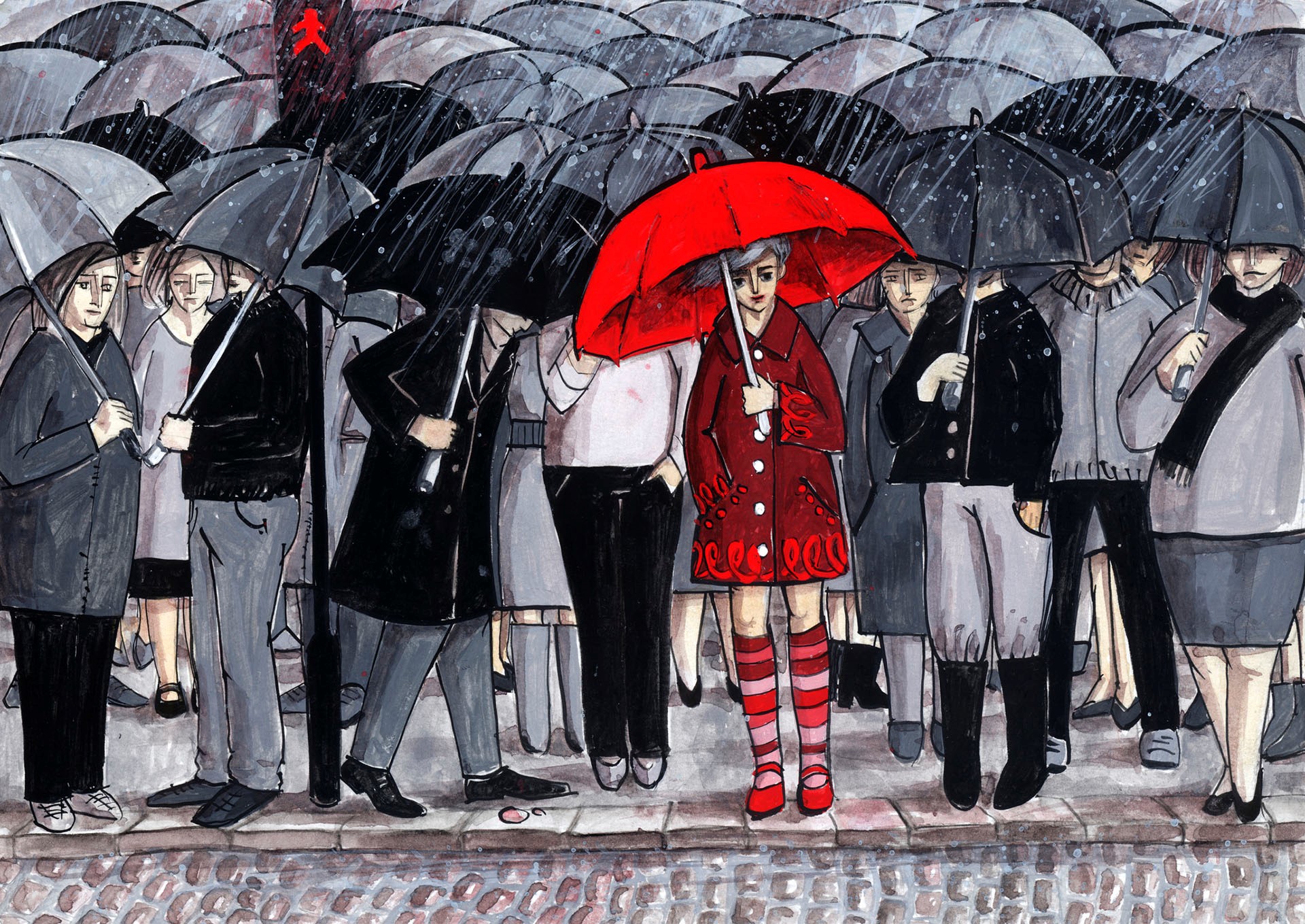
Georgiana Chitac / Moment Collection / Getty
Now, see what one of our course authors has to say.
Richard Vosseller, Program Director, Graphic Communication and Arts
Ask Yourself
Now that you've watched the video, what else do you notice about the image? What visual principles do you see that the narrator did not address? Look at the illustration again and see if you can find one principle of design or composition not covered in the video.
Resources
Principles of Visual Communication
The following three Week 2 learning resources offer more examples of some of the visual principles you've learned about. They go into more detail than you need for the purposes of this course, and some of them cover topics such as typography that are fascinating but not relevant here; however, even scanning these resources will prove illuminating—and perhaps inspiring.
Visual Principles in Art contains several examples of line and highlights the use of some visual principles in famous artworks.
Visual Principles: Point, Plane, Negative Space, etc. covers more of the principles you've read about.
Visual Principles: Contrast, Alignment, Hierarchy, etc. provides some charming examples of yet more principles.
Try It
As a final exercise before you move to the next section, click through the following images. See if you can identify examples of the visual principles discussed above.
mikroman6 / Moment Collection / Getty

Amir Mukhtar / Moment Collection / Getty

Cyndi Monaghan / Moment Collection / Getty
Jrg Mikus / EyeEm Collection / Getty

Annie Otzen / Moment Collection / Getty
Mark Hughes / EyeEm Collection / Getty
Part C. Putting it All Together: The FTC Palette
We've learned how to look at a composition so as to see how all the figures are organized. We've also learned about some of the visual principles artists and photographers use in conveying meaning in a composition.
Let's now look at a third way of analyzing an image. Just as those who produce images can use tools, visual consumers can use tools to quickly size up the component parts of an image and consider its meaning. One of these tools is the FTC palette, which helps us assess form, theme, and context. Form relates to much of what you already read, and theme and context will be explored further in the next lessons.
Let's take a quick tour of the tool.
Form: How the Work "Is"
Form here refers to the actual physical properties that you see when looking at art. Sometimes called formal or visual elements, form describes the overall composition and the individual elements within the composition. Many elements go into the formal properties of an artwork, most of which we have already discussed above:
- color,
- shape,
- line,
- texture,
- media used,
- size,
- design,
- style, and
- technique.
Theme: What the Work Is About
Theme refers to the overall subject of the artwork. In other words, how would you categorize the artwork? There are several recurring themes in Western art. These include the following:
- pastoral, as in landscape art;
- historical;
- still life;
- figure or animal study;
- mythological;
- biblical;
- portrait; and
- genre.
The term genre (also called genre art) refers to contemporary scenes of daily activities. (This is different from the more common use of genre to refer to category or classification.)
What happens when there is no discernible theme? This is usually found in non-representational or abstract art; the artist, in these cases, does not want to represent anything from the natural world, but rather a design, a concept, or a set of ideas.
Context: Where, When, By and For Whom, and Why the Work was Created
Context refers to the factual events, activities, influences, and any (or all) other factors that may have played a role in creating and interpreting the work of art. This is where you will likely perform research to gain a fuller understanding of the artwork. As you might suspect, most anything could fall into the category of context, from the patron who commissioned an artwork to a personal event in the artist's life. Among the many factors to consider in context are the social, political, philosophical, religious, and historical events that were taking place when the artwork was created. The key thing to remember about context is that it is concrete and factual.
In sum,
Form + Theme + Context → Meaning
Example: Using the FTC Palette
How does the combination of formal, thematic, and contextual qualities reveal layers of meaning? Let's take a brief look at how these qualities are used to "read" an image—in this case, one that you saw earlier in this lesson.
The following photo is something like what you would find on a company website or brochure. It should look familiar because we come across images like this in our daily lives. Let's use some of the terms we discussed in the previous sections to describe the form, theme, and context of this image.
PeopleImages / E+ Collection / Getty
First, we can generalize the basic composition into a series of simple shapes so that we can see the composition of the picture more clearly.
Original Image
PeopleImages / E+ Collection / Getty

PeopleImages / E+ Collection / Getty
Now, we can look at form, theme, and context.
Form
- Hierarchy: If we use disassociation to read this image as shapes and colors on a page, we see that the image is made up of a series of shapes moving left to right on the page in a pattern of alternated values: light, dark, light, dark. Of these shapes, which one is the biggest? Which one is the closest? That forms the hierarchy of importance. The figure on the right is the most important, because she is the biggest and closest.
- Line: As discussed earlier, there is an implied line that runs across the top of the series of figures. If we think of perspective, there is also an implied line running below the figures. Those implied lines can be seen to converge on the display board in the back.
- Movement: Movement in this image is created through the repeated series of figures running across the page.
- Balance: Even though there is a sense of visual hierarchy, visual balance is still achieved through the creation of a composition in which all the visual elements appear to be interconnected and working in unison. Although the figure on the right is the largest, it is balanced out by the multiple other figures (shapes) as well as the negative space on the left side of the image.
What else do you notice?
Theme
- Broad subject or big idea: professional people working.
- References: use of iconography that we are very familiar with, such as computers, display boards, and conference rooms.
- Symbolism: communication and interaction.
What else do you notice?
Context
- Present day: Use of symbols that reference contemporary technology create a sense of modernity in the image.
- Digital: Not only is the image itself in digital format, but the ideas that it communicates exist on digital platforms.
- Communication and social media.
What else do you notice?
Resources
The FTC Palette
For a similar discussion of the FTC palette and another example of its use—this time, on an ancient sculpture from Knossos—access the Week 2 learning resource The FTC Palette, from our ARTH 372 course on Western art.
References
Gombrich, E. H. (1995). The story of art. Phaidon Press.